Monthly Archives: September 2014
#Eyemails: 6 Powerful Reasons Why you Should include Images in your Marketing

I have become a habitual Instagrammer.
When I am out cycling, walking or just sitting admiring the view or the passing parade, I am looking for photo oportunities that I can snap and then share on my Instagram “app”.
All I need to be carrying is my iPhone or iPad and with my Instagram app waiting patiently for me, I can capture that photo, apply a snazzy filter and click the Facebook and the Twitter share buttons and it flies around the world.
It then showcases in my follower’s streams and updates and invites them to engage with me by commenting, liking or sharing.
Jamie Oliver a “celebrity chef”, understands this and with over 412,000 followers on Instagram has embraced the power of photos to market the Jamie Oliver brand.
Not surprisingly, the better the photo the more it drives engagement and Instagram takes my ordinary and average photos and gives them that “zing” factor (a good example is my Instagram photo from Istanbul, Turkey in the top right corner of this post) .
The Age of Visual Culture
We live in the age of the “camera in everyone’s pocket” and with more than 2.5 billion camera phones in use we are entering a new dynamic era around image creation and content according to Bob Lisbon from Luminate.
This can be broken into three phases as we enter the age of visual culture and language.
Phase One: Massive increase in photo creation
Ten percent of photos taken by humankind took place in the last 12 months
Phase Two: The Rise of Image Centric Social Networks
Photos are becoming the “universal language”. The fastest growing social media networks are not surprisingly Facebook, Tumblr and Instagram.
These social networks are the names on everyone’s lips as they have embraced the visual medium and have made it easy to upload and share images and photos online.
Phase Three: Images become Interactive
Pinterest is one of the first platforms that allows you to interact with static images and Luminate’s image apps (which are used by more than 100 million consumers) is also an example.
So how and why should you use images in your business communications, marketing and social networks?
6 Reasons Why Images are Important
If you have an online store, issue press releases or even just have a Facebook business “page”, then here are 6 reasons to publish images and photos as part of your business marketing tactics.
- Articles with images get 94% more total views
- Including a Photo and a video in a press release increases views by over 45%
- 60% of consumers are more likely to consider or contact a business when an image shows up in local search results
- In an ecommerce site, 67% of consumers say the quality of a product image is “very important” in selecting and purchasing a product
- In an online store, customers think that the quality of a products image is more important than product-specific information (63%), a long description (54%) and ratings and reviews (53%)
- Engagement rate on Facebook for photos averages 0.37% where text only is 0.27% (this translates to a 37% higher level of engagement for photos over text)
Read more: http://www.jeffbullas.com/2012/05/28/6-powerful-reasons-why-you-should-include-images-in-your-marketing-infographic/
#BSF (Best Solution Finance): BSF Financial Workshops – Fall 2014 #Eyemails

#Eyemails: 5 Ways Real Estate Professionals can use Facebook to Increase Sales

Facebook offers savvy real estate agents and brokerage firms a great way to connect with their community and potential buyers. The key is in providing long-term value. It’s a fact that buying a house is not something a person does every month, but every month someone is buying a house!
The social value lies in providing regular, valuable, consistent information. By becoming a trusted source via your Facebook posts, and then offering easy access on Facebook to tools for home searching, real estate professionals can benefit from the power of social media to build connections, stay in front of users when they are not buying, and ultimately be the trusted source to go to when the time for buying and selling comes.
5 Keys Real Estate Professionals Should be Doing on Facebook
1. Post Helpful Content and Tips
While it is tempting to simply share every listing and post from your website in news feed posts,DON’T! Remember that social media is about building relationships, being social, and offering value. Users are on Facebook to connect and engage with things of interest. Being too salesy all the time will not do it. A following and community can only be created if you actively seek out and share valuable content, yours and industry/community related, that inspires, informs, educates and connects.
Post on a regular schedule, such as 2-3 times per day at key times and in a way that invites Likes, Shares, and Comments.
2. Highlight Homes for Sale by Changing Your Cover Image
People are visual! Social Media is more and more visual! Images capture the eye. Now that Facebook no longer has a text limit of 20% on Cover Images, use the Cover Image regularly as a means of showcasing valuable items like a featured home. This can be changed out weekly or 2x a week. Consider using a Cover Image template to enable you to customize images quickly and be sure to edit the image to include a description and a link when it is posted. Here’s 12 ideas for creating more buzz with your Cover Image.
3. Incorporate Images and Video in Posts
As noted, people are visual and the popularity of Facebook and Pinterest prove that people connect with images. If you want to quickly capture the attention of your fans or followers, add images that are eye-catching and pleasing to the eye. Also, consider using simple tools like Vine and Instagram’s Video tool along with Facebook Video and YouTube as ways to easily create shareable videos that display well on Facebook.
Another idea is to create real estate Infographics, showcase photos of homes or local attractions within your area, post visuals of market trends, and showcase community and school news.
4. Add your Featured Listings to a Facebook Tab
While I noted you should NOT share every listing from your website in your news feed posts, you can share some listing and link via a Smart URL to a tab where users can view the rest of yours posts! Using a tool like TabSite’s WebSite ReSizer, it can take less than 10 minutes to add your website listings page to a custom tab and have it fit perfectly!
This add a great dimension of functionality to your fan page. When people are on Facebook, they want to stay on Facebook, and this allows them to do so by giving them the featured listing right on the Facebook page tab. Simply share a post about the property and include the Smart (mobile friendly) URL in the description so users can easily access it.
5. Incorporate your MLS web page to a Facebook Tab
In addition to a featured list tab, why not give visitors on Facebook full access to your website’s MLS search right on a tab! Once again, the TabSite Website ReSizer can be used to easily add your MLS search to your Facebook page. This can set you apart from so many other realtors and give you a key advantage!
Adding the web page is as simple as adding the URL, dragging the sizer to the appropriate view and publishing to your Facebook page. There’s no need to spend thousands of dollars on a separate feed, just use your website MLS listing in your Facebook page
BONUS TIP: Add a Email Sign-up Tab
By adding a Email sign-up tab to your Facebook page and making users aware of it periodically through posts and tips, real estate professionals can grow their email list and then reach potential buyers and sellers via this means as well.
https://www.tabsite.com/blog/5-ways-real-estate-professionals-can-use-facebook-to-increase-sales/
#LIAM NEESON: A WALK AMONG THE TOMBSTONES – In Cinemas September 18 #EYEMAILS

#CFI Markets: Experience the privilege of trading #Eyemails

#BARAKAT TRAVEL AND HOLIDAYS: DISCOVER MOROCCO #Eyemails

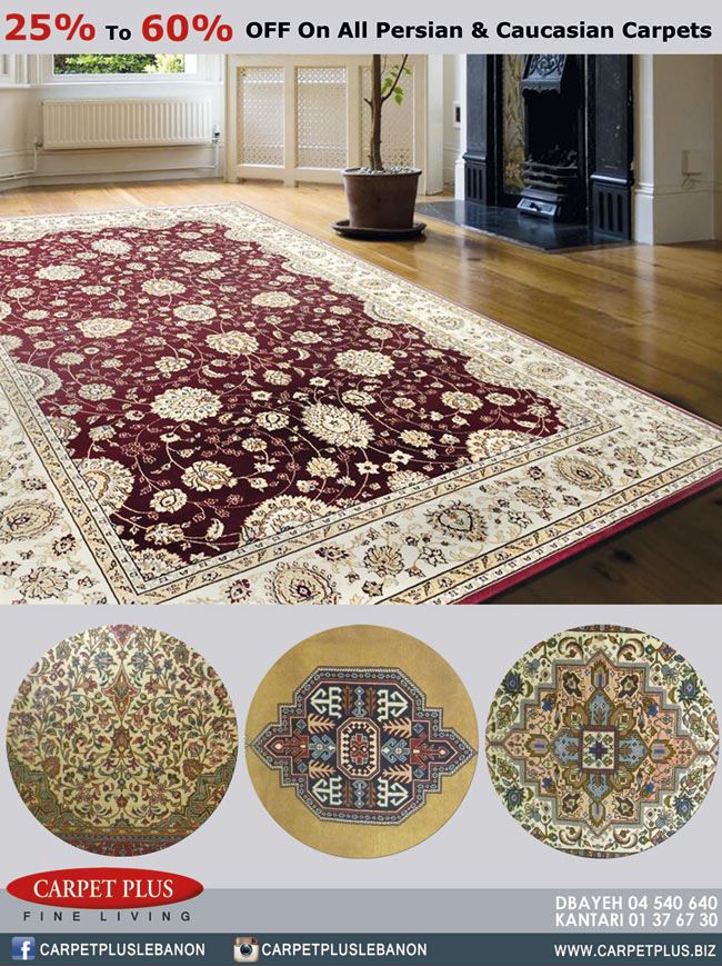
#Carpet Plus: IVV- S A L E #Eyemails

#Eyemails: Basic Principles of Minimal Web Design
Basic Principles of Minimal Web Design

A good web design properly enhances focus to specific parts of the website. It should be easy to navigate through and shouldn’t skip any important detail. Visiting a website for the first time tend to be more confusing for some users. It can also be tricky for web designers to deliver main ideas equally to all visitors. Despite their best efforts, some new visitors do get lost and they eventually leave the site to search for better alternatives.Clutter often encroaches upon web design and for sites with diverse types of visitors, it could be necessary to embrace minimalism. Minimal web design is characterized by more simplicity and less density. This approach involves using the least amount of colors, images, text and other elements to get core messages across and enhance visual appeal. Web designers should understand specific needs of visitors to create easy-to-understand website structure. Unfortunately, minimal web design isn’t everybody’s cup of tea and some designers are still struggling to remove the excess. Making a web design simple can be a difficult task. But understanding these minimal design principles may make things far easier for you:
Does Minimal Design suitable for your needs?
Not everyone needs minimal web design and not all websites should adopt minimalism. Website owners should analyze reasons behind minimal web design. It is inadvisable to push too hard if your website doesn’t really suitable with minimal approach. Sometimes, with an information-rich website, trying to fit everything into a minimal design can result in disaster. However, if messages within your website can be delivered accurately through minimal design, then go straight ahead.
Establish a Focus
Executing minimalism isn’t always easy. Before you start working, it’s necessary to establish focus. Messages should be delivered without involving too many elements. Compromises may need to be made and brainstorming is always important.
Chop off the Excess
The step is pretty obvious: Make a list of elements and contents used in your website. Rank them based on the level importance, you’ll be amazed on how many unnecessary elements that can be removed without reducing the usability.
Use Colors Properly
A minimal web design doesn’t restrict designers to basic colors only. Splashes of colors may indicate important areas and lead visitors to the right direction. Minimal design doesn’t have to be boring and dull. You can start by taking all colors off the website and consider a few color combination alternatives. Black and white is often considered as an all-time favorite in minimal web design, but they are not always necessary. Using proper colors are also important and good accents can easily highlight important areas and features. Colors matter a lot, even in minimal web design and you should work really hard to achieve effective colors usage.
Use Typography to enhance Content
Minimal web designs often emphasize more on typography to improve information delivery. After all the extra gimmicks are removed, there could be little left to display in the website, so naturally, typography is more important to gain users attention. Since users would be minimally distracted, typography can provide simple, yet attractive points of interest. Minimal designs are among the best platforms to use typography creatively. Selecting great fonts is important when creating an appealing minimal design. Your website’s personality can easily be enhanced with proper selection of typography.
Intelligent and Creative use of Layout
When it comes to the use of layout, even improper use of a few pixels can degrade the look of minimal design. Also, just because you have opted to choose a minimal web design, it doesn’t mean that you are stuck with overly simplistic layout structure. Layout is even more important on minimal designs as there are far fewer elements on each page. Again, minimal web designs are great places to experiment with intelligent layout. Easy navigation and proper placement of remaining website elements are key points. If you do it wrongly, visitors will have a hard time navigating your minimally-designed website.
Use Blank Space Properly
Minimal web designs are known for using ample blank space, which offers enough room to breathe. Web designers new to this approach often find it unintuitive to leave so many blank spaces unused. Remember, you can get more by using less. The “less factor” is an important concept in minimal web design and a useful tool for achieving your goals. After visiting a series of cluttered websites, minimally-designed websites can give users much needed break. Naturally, so many ideas pop in designers’ heads on how they should fill those empty spaces. In fact, during early years of Internet, web designers were often praised for their ability to fill blank spaces with “useful” things.
Use Images Properly
With all these repeated emphasizes on keeping everything simple and removing extra gimmicks, you may think that using images on minimally-designed websites is a big NO. That’s not true; in fact, images are bound to shine much brighter in minimal websites. Maintaining balance between simplicity, content and images require plenty of consideration. Often, images can deliver messages much more effectively than text, which can help you get rid of those ugly, long paragraphs.
#Carpet Plus: D I S C O U N T on all Persian & Caucasian Carpets #Eyemails
